


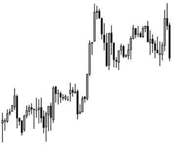
Candlestick chart
This type of graphic offers a more complete range of data over a specific time frame.
The chart is made up of a rectangle that represents the difference between opening price and closing price as well as lines representing the peak and trough values over a trading period.
In order to have a better image on price evolution, the colors representing the growth trends are differently colored from downtrends. Black/white, green/red are the most commonly used colors to indicate growth/decline.